Table of Contents
- Why Mobile-First Web Design Matters for Modern Businesses
- What Is Mobile-First Web Design?
- Why Does Mobile-First Design Matter?
- 1. Better User Experience on Smartphones
- 2. Responsive Layouts Adapt to Different Screens
- 3. Mobile Design Can Improve Navigation
- 4. Faster Access to Important Information
- 5. Better Forms and Conversions
- 6. Better Touch Interaction
- 7. Images Need to Be Responsive
- 8. Mobile-First Design Supports Better Performance
- 9. Mobile-Friendly Experiences Matter for Online Search
- 10. Better Local Business Experience
- Mobile-First vs Desktop-First Design
- Common Mobile Web Design Mistakes
- Tiny Text
- Small Buttons
- Horizontal Scrolling
- Overloaded Navigation
- Large Unoptimized Images
- Intrusive Pop-Ups
- Desktop Layouts Shrunk Onto Mobile
- How Businesses Can Build a Mobile-First Website
- Step 1: Identify the Main User Goals
- Step 2: Prioritize Content
- Step 3: Create a Simple Mobile Layout
- Step 4: Build Responsive Components
- Step 5: Test on Multiple Devices
- Step 6: Optimize Performance
- Step 7: Monitor Real User Behavior
- Mobile-First Is Not Mobile-Only
- Final Thoughts
Why Mobile-First Web Design Matters for Modern Businesses
People no longer access business websites only from desktop computers. Smartphones have become an important way for customers to discover businesses, compare services, read information, submit enquiries, make purchases, and contact companies.
For this reason, businesses need websites that work well on smaller screens from the beginning.
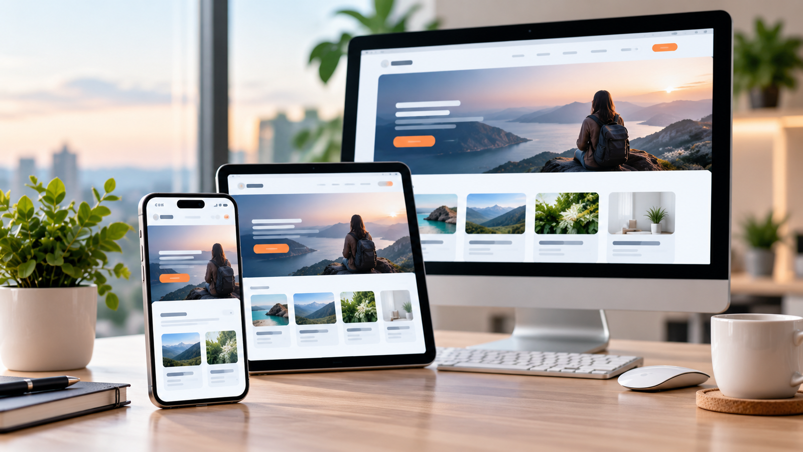
Mobile-first web design is an approach where designers and developers consider the mobile experience as a primary part of the website design process before expanding the experience for larger screens.
Google's developer guidance emphasizes responsive layouts that adapt to different display sizes, including responsive grids, media queries, and images that adjust to device dimensions and resolution.
What Is Mobile-First Web Design?
Mobile-first web design means designing the website experience around smaller screens first and then progressively enhancing the layout for tablets and desktop devices.
Instead of starting with a large desktop screen and trying to squeeze everything into a mobile layout later, developers first focus on the essentials:
-
Clear navigation
-
Readable content
-
Simple layouts
-
Fast interactions
-
Easy-to-use buttons
-
Accessible forms
-
Properly sized images
-
Important business information
The desktop version can then expand the layout and provide additional space and functionality where appropriate.
Why Does Mobile-First Design Matter?
A website should make it easy for visitors to accomplish their goals regardless of the device they use.
Consider a customer visiting a business website from a smartphone.
They may want to:
-
Find a phone number
-
Check business services
-
Request a quotation
-
Book an appointment
-
Submit an enquiry
-
View product information
-
Locate a business
-
Make a purchase
If the website requires excessive zooming, horizontal scrolling, or difficult navigation, the customer experience can quickly become frustrating.
Google's developer documentation notes that users expect responsive layouts and intuitive functionality across different devices.
1. Better User Experience on Smartphones
A mobile-first website prioritizes the information users need most.
For example, a service business may place:
Call Now | WhatsApp | Get Quote
prominently on a mobile screen.
The customer does not need to search through several desktop-style menus to find a contact option.
Good mobile design focuses on simplicity and usability.
2. Responsive Layouts Adapt to Different Screens
Modern websites need to work across many screen sizes.
A customer could use:
-
A small smartphone
-
A large smartphone
-
A tablet
-
A laptop
-
A desktop monitor
Responsive web design allows page layouts to adapt to these different environments.
Developers commonly use flexible layouts, CSS media queries, responsive images, and appropriate viewport settings to create these experiences.
3. Mobile Design Can Improve Navigation
Desktop websites often have enough horizontal space for large navigation menus.
Mobile screens do not.
A mobile-first approach encourages businesses to simplify navigation.
For example, instead of showing ten menu items at once, a mobile interface may use a compact menu containing:
-
Home
-
About
-
Services
-
Products
-
Blog
-
Contact
Important actions can also be highlighted separately.
The goal is not simply to make everything smaller. The goal is to make navigation easier.
4. Faster Access to Important Information
Mobile users often want answers quickly.
For a business website, important information might include:
-
Services
-
Pricing
-
Contact details
-
Location
-
Working hours
-
Booking options
-
Product information
A mobile-first layout helps businesses prioritize this information instead of filling the first screen with unnecessary elements.
5. Better Forms and Conversions
Forms are often an important part of business websites.
Examples include:
-
Contact forms
-
Lead forms
-
Demo booking forms
-
Registration forms
-
Appointment forms
-
Quotation forms
-
Checkout forms
Forms that are difficult to use on mobile can create unnecessary friction.
Mobile-first design can improve forms by using:
-
Larger input fields
-
Clear labels
-
Appropriate input types
-
Fewer unnecessary fields
-
Easy-to-tap buttons
-
Clear error messages
Google's documentation on mobile-focused experiences also highlights the importance of making digital interactions convenient and reducing unnecessary user input.
6. Better Touch Interaction
Desktop websites are designed around mouse pointers.
Mobile websites need to account for touch interaction.
Buttons and interactive elements should therefore have enough space for users to tap them comfortably.
For example, a mobile navigation interface should avoid placing several tiny links directly next to one another.
Good mobile design considers how people actually interact with their phones.
7. Images Need to Be Responsive
Large desktop images can create problems on mobile devices if they are not handled correctly.
A responsive website should ensure that images:
-
Scale appropriately
-
Maintain their proportions
-
Do not overflow the screen
-
Load efficiently
-
Remain visually useful on smaller displays
Responsive images are specifically included in Google's web-development guidance for adapting content to different device dimensions and resolutions.
8. Mobile-First Design Supports Better Performance
Mobile users may access websites through different network conditions and devices.
A mobile-first design process encourages developers to think carefully about what the page actually needs.
This can involve:
-
Compressing images
-
Reducing unnecessary scripts
-
Minimizing excessive animations
-
Loading only necessary resources
-
Optimizing fonts
-
Reducing unnecessary page elements
The result can be a simpler and more efficient website experience.
Performance should still be tested on real devices and network conditions rather than assumed from the design alone.
9. Mobile-Friendly Experiences Matter for Online Search
Mobile usability is also relevant to how businesses approach search visibility.
Google's search documentation emphasizes technical requirements and user-focused website practices, while its developer guidance continues to support responsive layouts across screen sizes.
This does not mean that simply making a website mobile-friendly guarantees higher rankings.
However, businesses should avoid technical and usability problems that make their websites difficult to access or navigate.
10. Better Local Business Experience
Mobile devices are particularly useful when customers are looking for local businesses.
Someone searching for a restaurant, clinic, hotel, service provider, shop, or other local business may want to immediately:
-
Call the business
-
View the location
-
Get directions
-
Check opening hours
-
Make an appointment
-
Visit the website
Google's Maps documentation highlights mobile-oriented experiences for activities such as finding business locations, viewing details, getting directions, and booking appointments.
A mobile-first website can make these actions easier to complete.
Mobile-First vs Desktop-First Design
The two approaches can be understood simply:
| Mobile-First | Desktop-First |
|---|---|
| Starts with smaller screens | Starts with large screens |
| Prioritizes essential content | Often begins with more available space |
| Simplifies navigation early | Navigation may need significant adaptation |
| Focuses on touch interaction | Primarily considers mouse interaction |
| Expands for larger screens | Compresses for smaller screens |
| Encourages content prioritization | Can lead to removing content later |
Neither approach automatically determines the quality of a website. What matters is whether the final experience is usable, accessible, responsive, and appropriate for the target audience.
Common Mobile Web Design Mistakes
Businesses should avoid several common problems.
Tiny Text
Visitors should not have to zoom in to read important content.
Small Buttons
Buttons that are difficult to tap can create frustration.
Horizontal Scrolling
Users generally expect websites to fit within the screen width.
Overloaded Navigation
Too many menu options can make mobile navigation confusing.
Large Unoptimized Images
Heavy images can increase page-loading requirements.
Intrusive Pop-Ups
Pop-ups that cover important content can make mobile experiences difficult to use.
Desktop Layouts Shrunk Onto Mobile
A mobile website should not simply be a smaller version of the desktop layout.
The content hierarchy and interaction patterns may need to change.
How Businesses Can Build a Mobile-First Website
A practical mobile-first development process can include the following steps.
Step 1: Identify the Main User Goals
Determine what visitors actually want to accomplish.
For example:
Service business:
View services → Contact business → Request quotation
Restaurant:
View menu → Find location → Make reservation
E-commerce:
Find product → View details → Add to cart → Checkout
Step 2: Prioritize Content
Put the most important information first.
Not every piece of desktop content needs to appear equally prominently on mobile.
Step 3: Create a Simple Mobile Layout
Design the essential mobile interface before expanding it for larger screens.
Step 4: Build Responsive Components
Use flexible layouts that adapt to different screen sizes.
Step 5: Test on Multiple Devices
Test:
-
Different smartphones
-
Tablets
-
Desktop screens
-
Different browsers
-
Touch interactions
-
Forms
-
Navigation
-
Images
Step 6: Optimize Performance
Review images, scripts, fonts, animations, and other resources that may affect loading and interaction.
Step 7: Monitor Real User Behavior
Analytics can help businesses understand which pages users visit, where they leave, and which actions they complete.
These insights can guide future improvements.
Mobile-First Is Not Mobile-Only
An important point is that mobile-first design does not mean ignoring desktop users.
A professional business website should provide a good experience across devices.
The process simply gives smaller screens and mobile interactions appropriate priority during design and development.
The desktop experience can then take advantage of the additional screen space available.
Final Thoughts
Mobile-first web design has become an important consideration for modern business websites.
Customers may discover a company, evaluate its services, contact its team, or complete a transaction from a smartphone. A website therefore needs to provide clear information, simple navigation, responsive layouts, accessible interactions, and reliable functionality across screen sizes.
For businesses planning a new website or redesigning an existing one, mobile-first thinking can help create a more focused and adaptable digital experience.
A website should not simply look good on a desktop screen. It should make it easy for customers to accomplish what they came to the website to do, wherever they access it.