Table of Contents
- What Makes a Business Dashboard Actually Useful?
- What Is a Business Dashboard?
- 1. A Useful Dashboard Starts With a Clear Purpose
- 2. It Shows the Most Important Information First
- 3. It Uses Relevant KPIs
- 4. It Makes Trends Easy to Understand
- 5. The Data Should Be Accurate and Up to Date
- 6. It Should Avoid Information Overload
- 7. Different Users Need Different Dashboards
- Business Owner
- Sales Manager
- HR Manager
- Operations Manager
- 8. Filters Should Help, Not Complicate
- 9. Good Dashboards Highlight Exceptions
- 10. Visual Design Should Support Understanding
- 11. The Dashboard Should Work on Different Devices
- 12. Drill-Down Can Add Significant Value
- 13. Dashboards Should Support Action
- 14. Data Security Matters
- 15. The Dashboard Should Reduce Manual Reporting
- Common Business Dashboard Mistakes
- Too Much Information
- Unclear Metrics
- Outdated Data
- Poor Visual Hierarchy
- Too Many Colors
- No Context
- No Action Path
- How to Build a Better Business Dashboard
- Step 1: Identify the Users
- Step 2: Define Business Questions
- Step 3: Select the KPIs
- Step 4: Identify Data Sources
- Step 5: Design the Layout
- Step 6: Build Filters and Drill-Downs
- Step 7: Add Security Controls
- Step 8: Test With Real Users
- Step 9: Improve Over Time
- Custom Dashboard or Ready-Made Dashboard?
- Final Thoughts
What Makes a Business Dashboard Actually Useful?
A business dashboard can look impressive with colorful charts, graphs, numbers, and real-time indicators. But a dashboard is not automatically useful simply because it contains a lot of data.
A truly useful business dashboard helps people understand what is happening, identify problems quickly, and make better decisions.
Whether it is used for sales, finance, inventory, employees, marketing, or overall business performance, the goal should be the same: present the right information in a clear and actionable way.
What Is a Business Dashboard?
A business dashboard is a visual interface that brings important business information together in one place.
Instead of checking multiple spreadsheets, reports, emails, and software systems, managers can use a dashboard to view key information through charts, tables, numbers, trends, and alerts.
A dashboard might show:
-
Sales performance
-
Revenue
-
Expenses
-
Customer activity
-
Inventory levels
-
Employee performance
-
Website traffic
-
Pending payments
-
Project progress
-
Key performance indicators
The exact information depends on the business and the purpose of the dashboard.
1. A Useful Dashboard Starts With a Clear Purpose
The first question should not be:
“What charts should we add?”
It should be:
“What decision is this dashboard supposed to help someone make?”
For example:
A sales dashboard may help managers identify which products are performing well.
An inventory dashboard may help employees identify products that need replenishment.
A financial dashboard may help management monitor revenue, expenses, and cash flow.
An employee dashboard may help HR track attendance, workload, or other operational indicators.
When the purpose is unclear, dashboards often become collections of unrelated charts.
2. It Shows the Most Important Information First
A dashboard should not make users search through dozens of numbers to find the information that matters.
Important metrics should be visible immediately.
For example, a management dashboard might begin with:
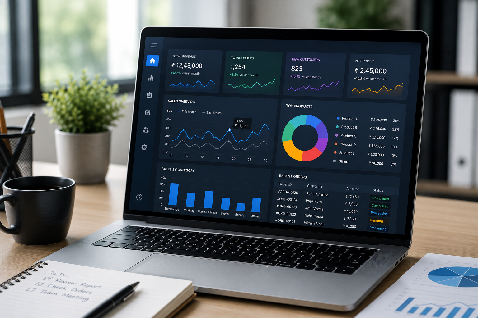
Revenue | Expenses | Net Profit | Orders | Customers
Additional details can then appear underneath.
This creates a visual hierarchy and allows users to understand the business situation quickly.
3. It Uses Relevant KPIs
More metrics do not necessarily mean better information.
A useful dashboard focuses on key performance indicators, or KPIs, that directly relate to the business objective.
For a sales team, useful KPIs might include:
-
Total sales
-
Number of orders
-
Average order value
-
Conversion rate
-
Sales by employee
-
Sales by product
For an operations team:
-
Pending tasks
-
Completed tasks
-
Delayed items
-
Inventory status
-
Processing time
For finance:
-
Revenue
-
Expenses
-
Outstanding payments
-
Profit
-
Cash position
The right KPIs depend on the role and purpose of the dashboard.
4. It Makes Trends Easy to Understand
A single number rarely tells the whole story.
Suppose a business generated ₹20 lakh in sales this month.
Is that good?
It depends.
If sales were ₹15 lakh last month, the result may represent strong growth. If sales were ₹25 lakh last month, the same number may indicate a decline.
This is why dashboards should often include comparisons such as:
-
Current month vs previous month
-
Current year vs previous year
-
Actual vs target
-
Current performance vs forecast
-
Current inventory vs required inventory
Trend information gives context to the numbers.
5. The Data Should Be Accurate and Up to Date
A beautiful dashboard with incorrect information is worse than no dashboard at all.
Users need confidence that the numbers they are seeing are reliable.
Depending on the business, data may come from:
-
ERP systems
-
CRM platforms
-
Accounting software
-
Websites
-
E-commerce platforms
-
Databases
-
Payment systems
-
Internal applications
-
APIs
Connecting data sources properly and defining how metrics are calculated is essential.
A dashboard should also clearly indicate the period or update time of the information when freshness matters.
6. It Should Avoid Information Overload
One of the most common dashboard mistakes is trying to show everything.
A screen filled with:
-
15 graphs
-
20 KPI cards
-
Multiple tables
-
Several filters
-
Large amounts of text
-
Different colors
-
Too many icons
may technically contain useful information, but it becomes difficult to understand.
A better dashboard prioritizes.
Start with the most important information and allow users to explore additional details only when needed.
7. Different Users Need Different Dashboards
A business owner, sales manager, HR manager, and accountant do not need the same information.
For example:
Business Owner
May want:
-
Revenue
-
Profit
-
Sales growth
-
Major expenses
-
Overall business performance
Sales Manager
May want:
-
Sales targets
-
Sales by employee
-
Leads
-
Conversions
-
Pending opportunities
HR Manager
May want:
-
Employee count
-
Attendance
-
Leave information
-
Recruitment
-
Department statistics
Operations Manager
May want:
-
Pending work
-
Inventory
-
Delays
-
Production or service metrics
A dashboard becomes more useful when it is designed around the person using it.
8. Filters Should Help, Not Complicate
Filters can be extremely useful.
Users may want to view data by:
-
Date
-
Department
-
Employee
-
Product
-
Location
-
Category
-
Status
However, too many filters can make a dashboard difficult to use.
The most useful filters are those that answer real business questions.
For example:
“Show me sales for the Engineering Department this month.”
A department filter combined with a date filter can provide exactly that information without requiring a separate report.
9. Good Dashboards Highlight Exceptions
Managers do not necessarily need to study every number every day.
A useful dashboard can help identify what requires attention.
Examples include:
-
Sales below target
-
Inventory below reorder level
-
Overdue payments
-
Delayed projects
-
Unusual expense increases
-
Declining customer activity
-
Attendance issues
This changes the dashboard from a passive reporting tool into a practical management tool.
Instead of asking:
“What happened?”
users can quickly identify:
“What needs attention?”
10. Visual Design Should Support Understanding
Good dashboard design is not about making everything colorful.
Each design element should serve a purpose.
Use:
-
Clear headings
-
Consistent spacing
-
Readable fonts
-
Logical grouping
-
Simple charts
-
Consistent labels
-
Appropriate contrast
Charts should be selected based on the type of information being presented.
For example:
Line charts are useful for trends over time.
Bar charts are useful for comparing categories.
Tables are useful when exact values matter.
KPI cards are useful for highlighting individual metrics.
The goal is clarity, not decoration.
11. The Dashboard Should Work on Different Devices
Many business users access information from laptops, tablets, or smartphones.
A dashboard that looks excellent on a large monitor but becomes difficult to use on a phone may not be practical for managers who work away from their desks.
A responsive dashboard should adjust its layout to different screen sizes while keeping important information accessible.
12. Drill-Down Can Add Significant Value
High-level information is useful, but sometimes users need to understand the reason behind a number.
For example:
Total Sales: ₹25,00,000
A manager may then want to see:
Sales by Department → Sales by Employee → Sales by Product → Individual Transactions
This is called drill-down functionality.
Instead of creating separate reports for every question, a well-designed dashboard can allow users to move from summary information to detailed data.
13. Dashboards Should Support Action
A dashboard should ideally lead to a decision.
For example:
Inventory low → Create purchase request
Payment overdue → Contact customer
Sales below target → Review sales pipeline
Task delayed → Assign additional resources
This is where business dashboards become particularly valuable.
They do not just show data. They help connect information to action.
14. Data Security Matters
Business dashboards may contain sensitive information such as:
-
Employee records
-
Salaries
-
Customer information
-
Financial data
-
Sales figures
-
Internal reports
Not every employee should necessarily have access to all information.
Role-based access can allow businesses to control what different users can see or modify.
For example:
Administrator → Full access
Finance Manager → Financial information
Sales Manager → Sales information
Employee → Personal or assigned information
Security should be considered during dashboard design rather than added as an afterthought.
15. The Dashboard Should Reduce Manual Reporting
One of the biggest benefits of a business dashboard is reducing repetitive reporting work.
Without a centralized dashboard, employees may have to:
-
Export data from multiple systems.
-
Open spreadsheets.
-
Combine information.
-
Apply formulas.
-
Create charts.
-
Prepare a report.
-
Send the report to management.
A connected dashboard can automate much of this process.
That means employees can spend less time preparing reports and more time analyzing results and improving operations.
Common Business Dashboard Mistakes
Even well-intentioned dashboards can fail because of simple design and data problems.
Too Much Information
Showing everything makes it difficult to identify priorities.
Unclear Metrics
Users may not understand how a KPI is calculated.
Outdated Data
Old information can lead to poor decisions.
Poor Visual Hierarchy
If every number looks equally important, users cannot quickly identify priorities.
Too Many Colors
Excessive colors can create visual confusion.
No Context
A number without a comparison or target may not mean much.
No Action Path
A dashboard should ideally help users decide what to do next.
How to Build a Better Business Dashboard
A practical dashboard development process can look like this:
Step 1: Identify the Users
Determine who will use the dashboard.
Step 2: Define Business Questions
Ask what those users need to know.
Step 3: Select the KPIs
Choose metrics that directly support those questions.
Step 4: Identify Data Sources
Determine where the information comes from.
Step 5: Design the Layout
Organize information according to priority.
Step 6: Build Filters and Drill-Downs
Add functionality that helps users explore information.
Step 7: Add Security Controls
Define access based on users and roles.
Step 8: Test With Real Users
Ask employees to use the dashboard and identify areas that are confusing or unnecessary.
Step 9: Improve Over Time
Business requirements change. Dashboards should evolve with them.
Custom Dashboard or Ready-Made Dashboard?
A ready-made dashboard can work well when your business processes are common and your software already provides the metrics you need.
A custom dashboard may be more suitable when:
-
Data comes from multiple systems.
-
Your KPIs are industry-specific.
-
You need custom calculations.
-
Different departments need different views.
-
You require unique workflows.
-
Existing dashboards are difficult to customize.
-
You need integration with a custom ERP or business application.
The right choice depends on the complexity and importance of the reporting requirements.
Final Thoughts
A useful business dashboard is not simply a collection of graphs.
It is a decision-support tool that presents the right information to the right people at the right time.
The strongest dashboards combine accurate data, meaningful KPIs, clear visual design, useful filters, appropriate security, and actionable insights.
Before building a dashboard, start with the business questions rather than the visual design.
Ask:
What does the user need to know?
Why do they need to know it?
What action should they take after seeing the information?
When those questions are answered clearly, the dashboard becomes more than a reporting screen. It becomes a practical tool for managing and improving the business.
This article is intended for general business and technology education. Dashboard requirements, data sources, security controls, and implementation approaches vary depending on the organization and its operational needs.